Status-Widgets
status.activelist status.badge status.collapse status.log status.message status.notify status.toaststatus.toast
Displays a notification toast
Parameters
{{ status.toast(id, item_trigger, item_title, item_content, item_icon, text_title, text_content, text_icon, param_template, item_button, text_button, value_button, param_allowclose, param_hideafter, param_showhide, param_showloader, param_color, param_bgColor, param_stack, param_align, param_position) }}
id
unique id for this widget(optional) If set, id is also used as class name for the dynamic toast and can be used for css styling.
item_trigger
a trigger item (true to open, false to close)
item_title
an item containing the title(optional)
item_content
an item containing content (optional)
item_icon
an item containing an icon (optional)
text_title
title (optional)
text_content
plain text or html code as content (optional, default = '')
text_icon
smartvisu icon to be used instead of the standard icons (info, warning, success, error). (optional, default = '')
param_template
standard template to be used (success, error, warning, info) (optional, default = '')
item_button
an item to send a value on button-press (optional, default = '')
text_button
button text (optional, default = '') button will show only if text is specified
value_button
value to be sent when the button is pressed (optional, default = '0')
param_allowclose
an option to close the toast manually (true, false) (optional, default = 'true')
param_hideafter
time in miliseconds until toast will hide (optional, default = '5000'). 'false' makes it sticky
param_showhide
fade-in effect to show the toast (plain, fade, slide) (optional, default = 'slide')
param_showloader
option to display a bargraph loader (true, false) (optional, default = 'true')
param_color
font color, not to be defined if a template is used (optional, default = '')
param_bgColor
background color, not to be defined if a template is used (optional, default = 'gray')
param_stack
number of stacked toasts. 'false' to show one stack at a time / count showing the number of stacked toasts (optional, default = '5')
param_align
Alignment of text in the toast i.e. left, right, center (optional, default = 'left')
param_position
Toast position on display (optional, bottom-left, bottom-right, top-left, top-right....) (optional, default = 'bottom-left')
Examples
{{ status.toast('toast0', 'bath.light.switch', '', '', '', 'Test with own icon', 'See how light value changes if you press the button',	'scene_livingroom',	'', 'bath.light.value', 'Quit', '20', 'true', 'false') }}

			{{ status.toast('toast1', 'bath.light.switch', '', '', '', 'Movement detected',	'This is the "success" template', '', 'success') }}

			{{ status.toast('toast2', 'bath.light.switch', '', '', '', 'Test info', 'This is the "info" template', '', 'info') }}

			{{ status.toast('toast3', 'bath.light.switch', '', '', '', 'WARNING!', 'This is the "warning" template', '', 'warning') }}

			{{ status.toast('toast4', 'bath.light.switch', '', '', '', 'E R R O R !', 'This is the "error" template', '', 'error') }}
Toggle the flipswitch in order to trigger the toast message
The first example shows how to send a value to an item by the toast. Dim the light using the dimmer and then watch the light while closing the topmost toast via the "Quit" button
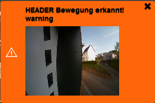
An item containing content, e.g. the video stream of a door station, can be displayed inside a toast. Send proper html code in the item or in the text field, e.g. '<img src ="<yourStreamURL>"'.
{{ status.toast('toast5', 'bath.light.switch', '','item.with.content', '', 'HEADER Bewegung erkannt', 'warning', '', 'warning') }}
Documentation for the jquery toast plugin: https://kamranahmed.info/toast
Author: bonze